Life Booster Tea needed to redesign their product packaging as they prepared to expand into grocery retail environments across Ontario. Their existing packaging did not effectively communicate the brand’s commitment to organic ingredients, natural wellness, and premium product quality. The goal was to create a packaging system that aligned with consumer expectations for organic products while meeting the visual standards required for placement on organic and natural food store shelves.
The Challenge
Regulatory & Retail Requirements vs. Shelf Appeal The primary challenge was balancing regulatory and retail packaging requirements with strong shelf appeal. The existing packaging lacked clear visual cues that consumers associate with organic products, making it difficult to differentiate from conventional tea brands.
Research-Driven Direction Research into organic food packaging trends and retail shelf environments surfaced opportunities to simplify the visual hierarchy, emphasize natural ingredients, and create a cleaner, more premium aesthetic aligned with consumer expectations within the organic category.
Improve Shelf Visibility in Competitive Grocery Environments Grocery shelves, especially in the tea and wellness aisle, are visually crowded, with dozens of competing brands all vying for a shopper’s attention in the few seconds it takes to scan past. The packaging needed a visual system that would draw the eye and read clearly at a glance while still holding up against closer inspection once a shopper picked it up.
The Process
To improve how the packaging communicated information and to make sure it genuinely resonated with the client’s target audience, I began with market research, studying organic food packaging trends and comparing the client’s packaging against local competitors on the shelf. I also conducted target audience research to better understand what health-conscious consumers were actually looking for when evaluating a product at the point of purchase. This research directly shaped the design decisions that followed: simplifying the visual hierarchy, emphasizing natural ingredients, and developing a cleaner, more premium aesthetic that helped the product stand out while still fitting authentically within the organic category.
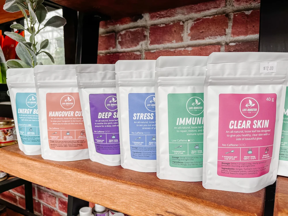
Before
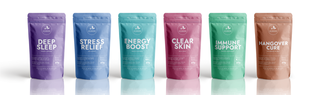
After
The Outcome
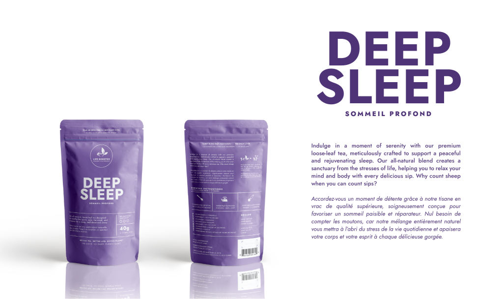
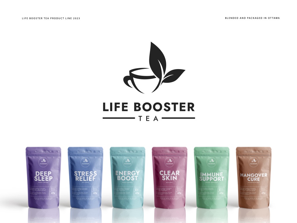
The redesigned packaging introduced a refreshed visual identity centered around transparency, wellness, and sustainability. Organic certifications and key product benefits were given greater prominence, while natural colour palettes, botanical imagery, and refined typography reinforced the brand’s commitment to quality ingredients.
The new packaging system created a stronger shelf presence and positioned Life Booster Tea alongside established organic brands found in Ontario grocery stores. By aligning the packaging with category standards and consumer expectations, the redesign helped strengthen brand credibility, improve product discoverability, and support the company’s retail growth strategy.
The final result was a packaging solution that not only met retail requirements for organic product placement but also elevated the overall perception of the Life Booster Tea brand, creating a more compelling and trustworthy experience for consumers.